Logo Design: Originality and Usability
Explore logo design, AI tools, delivery files and brand identity to make informed decisions about a distinctive, usable logo that works for your business.
What should a good logo design achieve?
A good logo should make a business easier to recognise and remain clear wherever it appears. Evaluation should go beyond aesthetic preference to consider distinctiveness, legibility and alignment with the brand’s positioning.
Before creating a logo, clarify your audience, the value you offer and what separates your business from competitors. A consultancy chosen for expertise and trust has different visual priorities from a consumer brand built around quick discovery and shopping. The design brief should explain that distinction rather than simply collect examples someone likes.
How should the logo creation process work?
Logo creation should move through research, concept development, design exploration, application testing and delivery. Agreeing on the output and approval owner for each stage prevents feedback from becoming a debate over personal preferences.
Design alternatives should express different strategic ideas rather than minor variations of the same shape. Test the chosen direction in a website header, on a mobile screen, in a proposal and as a small profile image. When requesting revisions, describe the problem in a specific application instead of asking for something that simply feels more impressive.
Where does AI help with logo design?
AI logo design tools can help explore early ideas and compare visual directions quickly. However, a generated image should not automatically be treated as production-ready, original or legally clear to use. AI logo makers do not remove the need for design judgement and verification.
Before choosing a tool, review its commercial-use terms, how it handles uploaded data and its export options. Letterforms, similarities to existing brand marks and small-size legibility require human review; the selected idea may also need to be redrawn as clean vector artwork. Visual similarity checks are useful, but they do not replace a legal assessment of trademark registrability.
Which tests should a corporate logo pass?
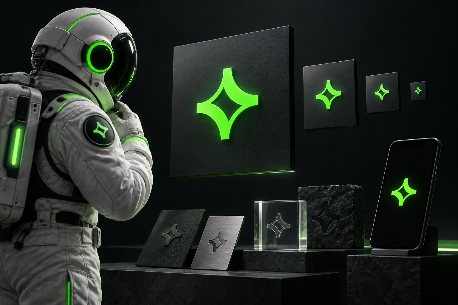
A corporate logo should remain effective at small sizes, in a single colour, on light and dark backgrounds and in common print applications. Alternative layouts for horizontal or narrow spaces should retain the identity of the main mark. The aim is a recognisable set of versions, not the preservation of every detail at every size.
Define delivery requirements explicitly, including editable vector source files, SVG for the web, transparent PNG files and print-ready PDFs where needed. A concise guide should specify minimum sizes, clear space, colour values and examples of incorrect use. Font licences and rights to use the design should also be clarified in the contract.
When should a logo project become a brand identity project?
If a business’s website, presentations and sales materials speak different visual languages, it needs a coherent brand identity rather than just a new logo. The logo provides recognition, while typography, a colour system, imagery and layout rules create consistency. If the existing logo already works, improving the system around it may be more appropriate than replacing it.
When comparing professional proposals, look beyond the number of logo concepts to the research scope, revision limits, delivery files and realistic application examples. tingdea considers brand identity and web design together, bringing the logo’s use across digital touchpoints into the design process. Arriving with existing materials, priority applications and the perception you want to change makes it easier to define an appropriate scope.
Got a project on this topic?
Write to us