What Should Corporate Identity Design Include?
Define your corporate identity design scope around brand strategy and practical needs, compare proposals clearly, and build a consistent brand presence.
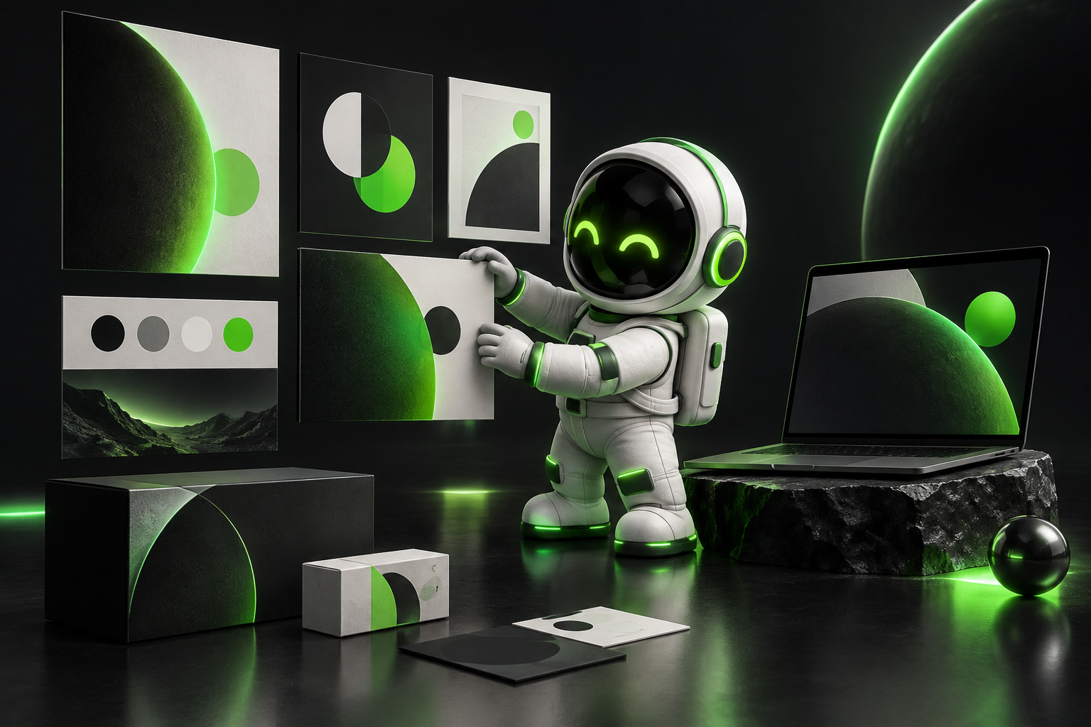
Corporate identity design is more than a logo
Corporate identity design is the system of visual rules and applications that makes a business recognisable across different settings. The logo sits at its centre, while typography, a colour palette, layouts, imagery guidelines and core templates complete the identity.
Brand strategy and tone of voice guide the visual identity, but dedicated work on either may not be included in every design proposal. When requesting a quote, clarify not only which files will be produced, but also which strategic decisions will underpin the design.
Audience and positioning determine the scope
The right scope starts with whom the business serves, how it stands apart and which commercial objective the identity needs to support. A new company may prioritise establishing credibility, while a business with several services may need to make the relationship between those services clearer.
The design brief should cover target customers, their reasons for buying, competitors and the intended brand perception. If the business has multiple products or sub-brands, decide early whether they will share one identity or use related sub-identities. This grounds visual choices in business needs rather than personal taste.
Which applications belong in the package?
The package should cover the touchpoints where the business meets its customers most frequently and where those interactions matter most. A B2B service company may prioritise proposals, presentations and its website, while a product business may also need packaging and labels.
The core system should clearly define logo variants, typographic hierarchy, colour values and usage rules. Website design, packaging production and ongoing content creation may be separate workstreams rather than part of the identity project. The proposal should specify whether each application is an illustrative mockup, an editable template or production-ready artwork.
Consistency does not mean identical designs everywhere
A consistent identity adapts recognisable elements to different conditions instead of copying the same layout across every medium. A small screen, a long presentation and a printed document can express the same typographic hierarchy through different arrangements.
When selecting a design direction, review examples built with real content rather than relying solely on polished presentation mockups. A long company name, a dense proposal page or a bilingual website heading can reveal how flexible the system really is. For digital applications, readability and accessible contrast should be assessed alongside aesthetic choices.
Compare proposals by scope, not by file count
Corporate identity design proposals become comparable when research depth, design directions, revision limits, application range and usage rights are assessed on the same basis. Ask for written confirmation of whether font and image licences, source files, additional adaptations and post-project support are included.
tingdea can bring brand identity and web design together to help plan a visual system that works across digital applications. Bringing existing materials, a target customer profile and a list of priority touchpoints to the initial discussion helps make the scope concrete. When allocating the budget, consider completing the core system and essential applications first, with less frequently used materials scheduled for a later phase.
Got a project on this topic?
Write to us